Sunday, 19 April 2015
Friday, 17 April 2015
Thursday, 16 April 2015
Wednesday, 15 April 2015
Wednesday, 8 April 2015
Evaluation Question 1
In what ways does your media products use, develop or challenge forms and conventions of real media products?
Title
With our film having focus of time and time running out which is apparent with the two CU shots of clocks as well as the sound of the ticking clock throughout we decided to name our film One Less Hour as this creates a sense of time running out. The genre we chose was Crime Thriller, therefor we chose a narrative of a teenage girl being followed and subsequently abducted by a male character. Not having a typical abduction film name such as "Taken' or "Abduction"creates a stronger sense of suspense.
Our research showed that the typical conventions of crime thrillers is that they have disjointed typography, for example in David Finchers Se7en. We also liked the white on black colour scheme as it will simplistic, easy to read and didn't give too much away. From this research we decided to have our title fade in from black. This also connotes something or someone coming out from the dark, which relates to our genre and narrative. We found several typographies that we liked and fitted the genre, we audience tested these and we settled on a font we liked.
Credits
We chose a typography called American Typewriter for the credits, each word appears on the screen as if it is being typed, which adds a level of ambiguity to the film and credits. This text is more bold than the title as it has to stand out on the screen, not just a black screen. We researched films such as Shutter Island and the Talented Mr Ripley and they share the same conventions of typography in how they appear on the screen and how the text is constructed. Again we audience tested these and we chose one that was most favoured.
Conventionally film openings contain credits that have a style that reflects the narrative, for example Se7en has credits that have a scrappy, twisted look that represents the tone of the film. The title also conventionally reflects the narrative and themes, for example Se7en's title reflect the narrative as the seven deadly sins are prominent in the film. Furthermore credits conventionally appear in an order to show the importance of the cast/crew, we did this in reverse, therefor subverting the norm.
For the content of our credits we went back to our research and found what credits were mostly used in film openings. We found these to be:
We used several props in our opening, we used these to represent a crime thriller. Our biggest prop was the planning board, this was used to foreshadow the events of the abduction to the audience and show the systematic approach of the antagonist.
In our research we found that V for Vendetta shared a similar opening to ours as having a dual narrative, in this film the two narratives are linked together via a TV screen. We decided that ours should be linked together by the props of a laptop clock, phone clock and a watch. The element of time is strong within the narrative.
Location/setting
The bedroom set was used to represent a teenage girl, we used props of a dressing table and make up to represent the character of the teenage girl. These props are relatable to the audience and makes the set up more believable. Again we took Inspiration from V for Vendetta where Natalie Portman is seen getting ready to go out with a similar set up. Unfortunately we had some issues that required us to change our filming location from where we had originally planned to film, however this not hinder us too much, we found issues with the smaller space however we found overall this location suited the narrative better.
Shots
We used a large variety of shots in our opening, close ups were often used to show a point of particular importance in our narrative, for example the watch, and the shots of the two characters getting ready. We used mid shots to show the characters getting ready. As well POV shots to show the relationship between the characters as well as show the audience what they are seeing. We used long shots in several places to establish a location. Particularly when the characters are first seen in a shot together. If we were to redo this project we would like to put an extreme long shot or an establishing shot to try a solidify the location for the audience more.
Conventionally in film openings the characters are introduced through a variety of shots, antagonists are conventionally introduced in a dramatic sense, or during a criminal act. One example of this is the Joker in the Dark Knight (2008) and Hans Gruber in Die Hard (1988). Conventionally films have a wide variety of shots to avoid a monotonous viewing experience. The first shot that fully shows the antagonist is a panning shot that partially shows the face, this is to keep a sense of mystery. A technique which is used in The Departed (2005) where Frank Costellos face in partially obscured within the opening.
Editing
To show the narratives were happening simultaneously we decided to add a transition that smoothly links the two narratives together, this takes place at 0:27 and 0:35, the camera appears to go through the wall and emphasises the dual narrative. We took inspiration from the V for Vendetta opening for this transition. We also used a fade to black at 1:02 to show time has passed and that a new location is being established. In our editing process we also added a bleach bypass 2 filter for the antagonist to show that the locations are different and to emphasise the dual narrative. Conventionally films use linear editing, jump cuts are used to show a progress in time. The Star Wars saga is an example of this as they use a variety of transitions, such as circle open and close, and swiping transitions.
Narrative
Our narrative is a dual narrative with two characters and further on in the opening they meet. The first character seen is the protagonist then it switches back and forth from the antagonist, this gave the audience time to work out what was going to happen between the two characters. We also used the non-diegetic sound of a ticking clock to suggest that the two narratives were simultaneous. Although dual narratives are not conventionally used
Title
With our film having focus of time and time running out which is apparent with the two CU shots of clocks as well as the sound of the ticking clock throughout we decided to name our film One Less Hour as this creates a sense of time running out. The genre we chose was Crime Thriller, therefor we chose a narrative of a teenage girl being followed and subsequently abducted by a male character. Not having a typical abduction film name such as "Taken' or "Abduction"creates a stronger sense of suspense.
Our research showed that the typical conventions of crime thrillers is that they have disjointed typography, for example in David Finchers Se7en. We also liked the white on black colour scheme as it will simplistic, easy to read and didn't give too much away. From this research we decided to have our title fade in from black. This also connotes something or someone coming out from the dark, which relates to our genre and narrative. We found several typographies that we liked and fitted the genre, we audience tested these and we settled on a font we liked.
Credits
We chose a typography called American Typewriter for the credits, each word appears on the screen as if it is being typed, which adds a level of ambiguity to the film and credits. This text is more bold than the title as it has to stand out on the screen, not just a black screen. We researched films such as Shutter Island and the Talented Mr Ripley and they share the same conventions of typography in how they appear on the screen and how the text is constructed. Again we audience tested these and we chose one that was most favoured.
Conventionally film openings contain credits that have a style that reflects the narrative, for example Se7en has credits that have a scrappy, twisted look that represents the tone of the film. The title also conventionally reflects the narrative and themes, for example Se7en's title reflect the narrative as the seven deadly sins are prominent in the film. Furthermore credits conventionally appear in an order to show the importance of the cast/crew, we did this in reverse, therefor subverting the norm.
For the content of our credits we went back to our research and found what credits were mostly used in film openings. We found these to be:
- Producer
- Editer
- Cast
- Director
- Studio
- Music
We included these in our film opening. and positioned them in places that they would be most visible and not to obscure the narrative. This came as quite a challenged because of the dark costumes and the black typography.
Props
We used several props in our opening, we used these to represent a crime thriller. Our biggest prop was the planning board, this was used to foreshadow the events of the abduction to the audience and show the systematic approach of the antagonist.
In our research we found that V for Vendetta shared a similar opening to ours as having a dual narrative, in this film the two narratives are linked together via a TV screen. We decided that ours should be linked together by the props of a laptop clock, phone clock and a watch. The element of time is strong within the narrative.
Location/setting
The bedroom set was used to represent a teenage girl, we used props of a dressing table and make up to represent the character of the teenage girl. These props are relatable to the audience and makes the set up more believable. Again we took Inspiration from V for Vendetta where Natalie Portman is seen getting ready to go out with a similar set up. Unfortunately we had some issues that required us to change our filming location from where we had originally planned to film, however this not hinder us too much, we found issues with the smaller space however we found overall this location suited the narrative better.
Shots
We used a large variety of shots in our opening, close ups were often used to show a point of particular importance in our narrative, for example the watch, and the shots of the two characters getting ready. We used mid shots to show the characters getting ready. As well POV shots to show the relationship between the characters as well as show the audience what they are seeing. We used long shots in several places to establish a location. Particularly when the characters are first seen in a shot together. If we were to redo this project we would like to put an extreme long shot or an establishing shot to try a solidify the location for the audience more.
Conventionally in film openings the characters are introduced through a variety of shots, antagonists are conventionally introduced in a dramatic sense, or during a criminal act. One example of this is the Joker in the Dark Knight (2008) and Hans Gruber in Die Hard (1988). Conventionally films have a wide variety of shots to avoid a monotonous viewing experience. The first shot that fully shows the antagonist is a panning shot that partially shows the face, this is to keep a sense of mystery. A technique which is used in The Departed (2005) where Frank Costellos face in partially obscured within the opening.
Editing
To show the narratives were happening simultaneously we decided to add a transition that smoothly links the two narratives together, this takes place at 0:27 and 0:35, the camera appears to go through the wall and emphasises the dual narrative. We took inspiration from the V for Vendetta opening for this transition. We also used a fade to black at 1:02 to show time has passed and that a new location is being established. In our editing process we also added a bleach bypass 2 filter for the antagonist to show that the locations are different and to emphasise the dual narrative. Conventionally films use linear editing, jump cuts are used to show a progress in time. The Star Wars saga is an example of this as they use a variety of transitions, such as circle open and close, and swiping transitions.
Narrative
Our narrative is a dual narrative with two characters and further on in the opening they meet. The first character seen is the protagonist then it switches back and forth from the antagonist, this gave the audience time to work out what was going to happen between the two characters. We also used the non-diegetic sound of a ticking clock to suggest that the two narratives were simultaneous. Although dual narratives are not conventionally used
Thursday, 26 March 2015
Tuesday, 24 March 2015
Post-production: Final changes

One final change we decided on one was to change the size of our final title as we thought it need to appear more dominant on the screen.
Wednesday, 18 March 2015
Production: Adding titles.

During the post-production process we added credits to our film, we used LiveType to create and edit our credits, We added 7 credits that appear on screen in a type effect, in a black font called American Typewriter.
Friday, 13 March 2015
Post production: Sound
Although we already had the intention of adding sound, due to our audience testing we had a better idea of our target audiences preferred music, being either a score or incidental music. We search the internet for some copyright free music, we found several pieces we thought that fitted our film.
The piece we found is called Tocsine Hell.
We also downloaded a ticking clock sound which will a non- diegetic incidental sound. We got this from www.freesfx.co.uk.
The piece we found is called Tocsine Hell.
We also downloaded a ticking clock sound which will a non- diegetic incidental sound. We got this from www.freesfx.co.uk.
Friday, 6 March 2015
Additional editing
After our target audience research we chose to put a filter on our film to create a more dark and sinister effect, as well we found some copyright free music to add to our film to create more suspense and suit the narrative.Furthermore we ended the speed and in and out timings of some of the first sections shot, to crete a more coherent narrative. We also slowed down the ident and added a sound effect to create a more authentic look.

Pre-production: Audience testing rough cut
http://youtu.be/x8goO2J8oXc
We additionally also gave a questionnaire to 4 other people asking them to express their views. We consulted 2 females (Leah Tait 18 and Hannah Rumford 21) and 2 males (Tom Denny 19 and Theo Ellis 20) and these are their views:
What could be improved about the footage itself?
We additionally also gave a questionnaire to 4 other people asking them to express their views. We consulted 2 females (Leah Tait 18 and Hannah Rumford 21) and 2 males (Tom Denny 19 and Theo Ellis 20) and these are their views:
What could be improved about the footage itself?
- Some of the shots were a bit shaky so you could maybe reshoot these
- A couple of the shots were on for a long time so you could cut these
- It was very light in the outside shots so you might want to think of adding a filter
- I would vary the timing of the shots a bit more
What kind of music do you think should be added?
- I think it would be good to add music that added emphasised certain parts of the opening
- Something that built suspense and tension
- Maybe some music that changed in volume throughout the opening
- Possibly some fast paced music
Does the opening set a good tone for the rest of the film and represent the narrative?
- Yes, I think I can clearly understand that this is the opening of a crime thriller with the use of props and different shots
- The opening really made me want to see the rest of the film and intrigued me about the suspicious character
- I thought the two narrative style worked together well as some shots were mirrored so this set a good tone
- I really enjoyed the opening! I think you need a good piece of music to set the a mood for the rest of the film that represents the narrative
These comments helped us get a good display of ideas to help us create our final production.
Tuesday, 3 March 2015
Production: Rough cut edit
After filming both parts of our narrative we also shot the outside scenes, we then subsequently edited the shots together and added an ident and an end title.
Monday, 2 March 2015
Production: Filming part 2
After filming both sections for the male and female parts separately, we decided to make a rough cut of the two narratives. This will take up the first minute with our film.
Wednesday, 25 February 2015
Production: Editing
After we finished filming we started to edit our footage together using Adobe Premier Pro. We added transitions where necessary, rough credits as well as putting our shots in chronological order. We also added our ident and our title screen.

Production: Filming day 2
On Wednesday the 25th February we filmed the outside section of our film (3rd section), Due to complications we had to film in Rose Hall Lane, Middleton Cheney instead of Arbury Banks in Chipping Warden, We managed to film all the shots we wanted.

Thursday, 12 February 2015
Production: Ident
To make our opening look as authentic and real as possible we decided to make an ident, For this we used Adobe After Effects CC 2014.

The ident will appear at the start of our film, which is typical of all films. And will reveal the name of our production company Rumford Roberts Productions. There will be a scratching sound effect which we obtained from www.freesfx.co.uk this will be placed on top of the ident and will be diegetic.
Tuesday, 10 February 2015
Production: Make Up
On the day of filming we gave ourselves half a hour of preparation of clothing and make-up. Chloe focused on a more 'natural' look as it resembled the character we wanted to present for her, we used the naked 2 eyeshadow palette as it resembles a modern audience and has a range of colours which we can use to create our preferred look.


Thursday, 5 February 2015
Production: Film title
For our main title we decided to pick three and use a focus group to find a typography that our target audiences can relate to. More importantly it has to relate to our genre.
1.
2.

3.

We asked 6 people for choice and to add some comments
Font:
1. 2
2. 1
3. 3
Text 3 had the majority of votes, George Beeson said "It fitted the target genre better than the others"
We asked William Garner 17, George Beeson 18, Leah Tait 18, Hannah Rumford 21, Tom Denny 19 and Theo Ellis 20
Based on our results we decided to go with typography 3, as it was most favourable with our target audience. The font is You murderer
Production: Sound effects
In our film their will be a continoues clicking of a clock throughout to build suspense, it will be non-diegetic We went online and a free sound effect that will fit our film well.

We chose the Clocks-Large Clock-Int-ECU Hard Metal Clicks as it was the best for our film. It didn't have much background noise and had a consistent ticking throughout.
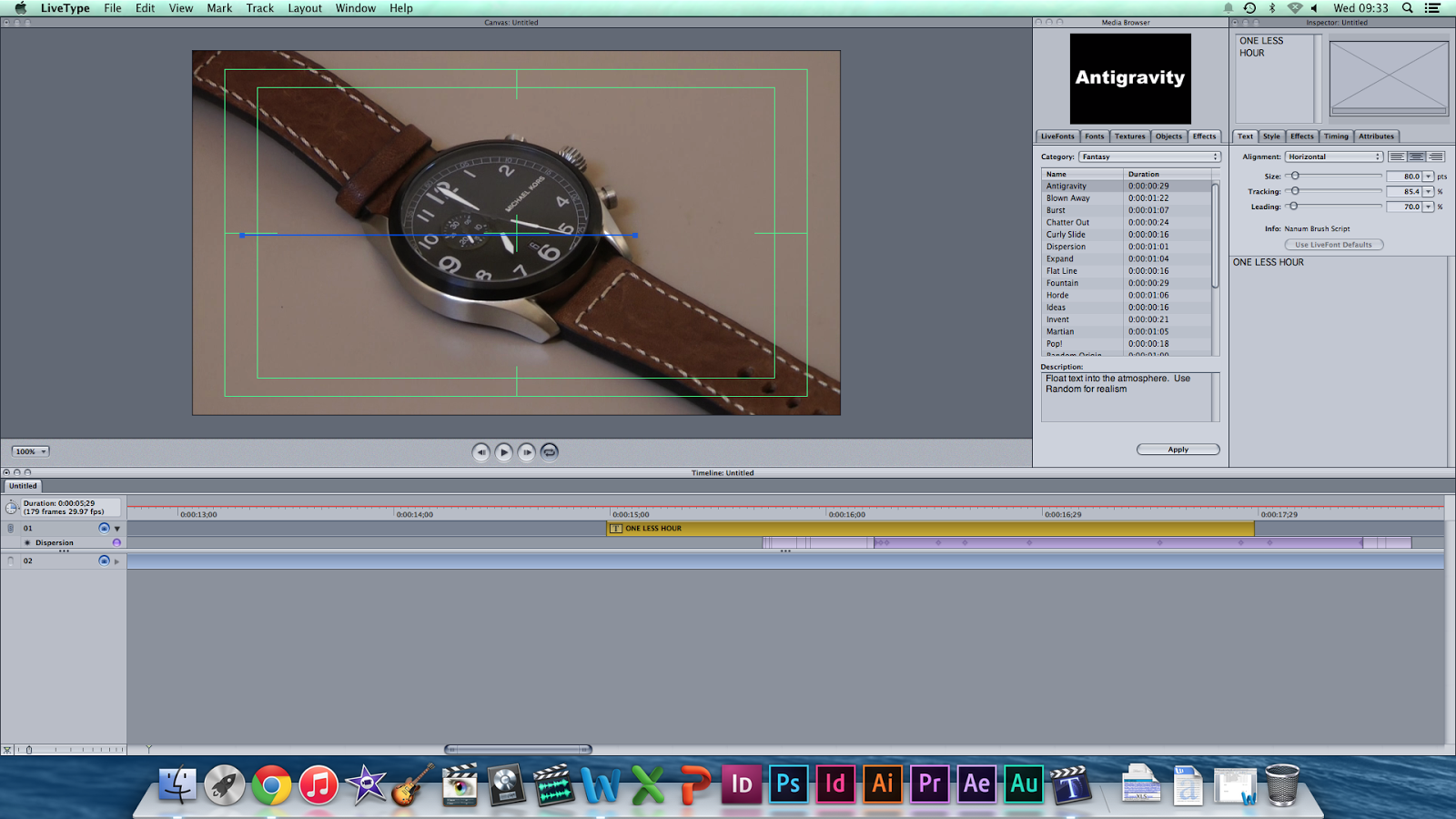
Production: Deciding title typography
For our titles we have chosen three different typography's from LiveType:
American Typewriter-Regular
MS PGothic- Regular

Nanum Brush Script- Regular

Focus Group
We audience tested these font's with our target audience, being predominately young adults from 16-25 and asked them to choose the font that best fitted the genre. We asked 6 people for their choice and to add some comments:
American Typewriter: 4
MS PGothic- Regular: 1
Nanum Brush Script: 1
American Typewriter appears to be favourite George added "The typewriter style makes it feel older and adds more of a mysterious level" and Joe added 'That the others were too basic and curved, the formal style goes well with the genre"
We asked Joe Castle 18, George Youel 18, Sophie Tyacke-Norton 17, Tom Denny 19, Leah Tait 18, Dan Head 20.
Based on this research we established that our font should be American Typewriter, as it was most favoured with our target audience and gives a good sense of ambiguity for our film.
Based on this research we established that our font should be American Typewriter, as it was most favoured with our target audience and gives a good sense of ambiguity for our film.
Thursday, 29 January 2015
Equipment and software: Part 2
Software.
For all of our editing we will be using Adobe Premier Pro CC 2014, this is a professional piece of software (Used to make Hollywood films such as Gone Girl), This software gives us all the tools we need to produce our film.


As well as this we will be using Live Type for our credits in collaboration with Adobe Premier Pro CC 2014, this will allow us to create movement for our credits, as well as choice for size, colour and most importantly typography.

We will be using an Apple iMac 21.5 inch desktop to do our editing. The big screen, picture quality and performance of this computer will allow us for the best editing we can get.

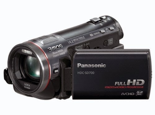
Equipment and software
For our filming we will be using a Panasonic HDC-SD700 camcorder, the camera shoots in HD which gives a good picture which will give our film a professional look. Furthermore the camera has a zoom feature, which will help for some of our shots. We also used our own SD cards to store our clips.
This camera will be mounted on Velbon CX 888 tripod, and for our panning and tracking shots it will be upon a dolly. This will be used to steady our shots as well as using high angle shots thanks to it's extendable top.

The dolly is a Velbon DL 11 Tripod Dolly, this will help us move the tripod and camera around steadily which is important for the quality we are hoping for in our film.

Storyboard edit 1
Throughout our pre-production and production stage we found that our storyboard needed to be edited. We needed the narrative to be longer and we included a wider variety of shots, this will give a more disturbed effect which supports our chosen genre.


Tuesday, 27 January 2015
Production: Props
Planning board
We updated the prop of the planning board, we used string to show a narrative through the board.

Dressing table
We also set up a dressing table for the girls bedroom, with the following props, this picture does not represent the final composition, however it is a good representation. There will also be an alarm clock.

Wednesday, 21 January 2015
Production: Making credits
We spent two hours on Wednesday the 21st of January editing and deciding on credits to use in our film. We used our rough edit as a backdrop and used LiveType and Adobe Premier Pro CC 2014 to edit these, we had a strong idea of a typewriter feel, we achieved this by a typing effect as well as a typewriter font. However for the title we chose a more dominating and malicious font to reinforce the genre of crime thriller. We saved all our fonts into a secure folder.


Filming: Day 1
We did our first day of filming on the 17th January 2015, we decided to film the narrative that focused on the antagonist. We filmed all of our desired shots and made a rough edit, upon looking at this we discovered few errors in both camera steadiness and continuity. We hope to fix these on the 31st of January. We changed a few shots in our storyboard because we thought these new shots worked better in the scene. For the mise-en-scene we used our own props, eg watch, noticeboard, as well as costumes, eg black hoodie, jeans and shoes.


Subscribe to:
Posts (Atom)